Tubi, Volkswagen Tiguan and more: top creative ads & advertising roundup
Every week I attempt to share a curated list of clutter breaking creative ads. The first and most important task of creating ads is to be noticed by the right, relevant audience. Aspects like memorability, and driving a behavioural or mindset change come later. Here are a few campaigns & issues which caught my this past week or so:
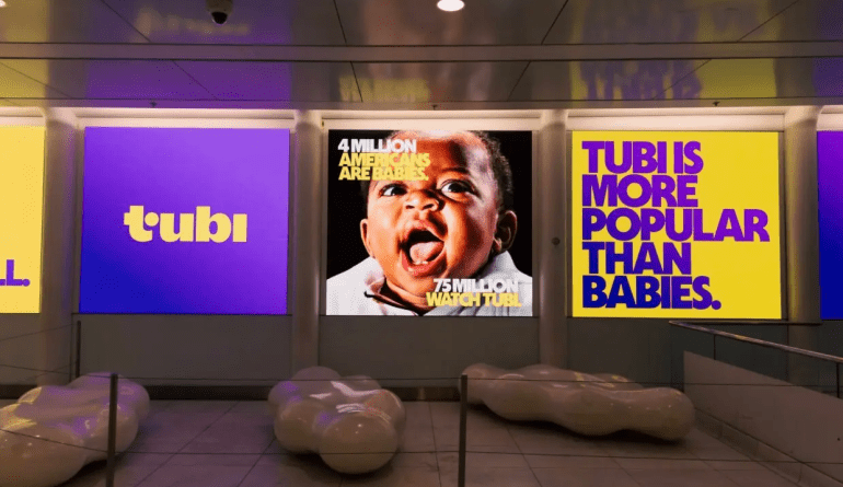
TUBI: more popular than
At Trikaya – my first ad agency, there used to be the ‘5-10 Principle‘. The belief was that ‘what to say’ (strategy) and ‘how to say it’ (creative) are the two critical aspects of advertising. The former got a score of either 0 or 5. The logic being that either you said the right thing (for the brand) or not. There was no half-way house there. The creative then would raise the bar in the manner (from 6 to 10) in which the message is delivered. The best of ads have a sharp, single minded ‘what to say’ and then a creative idea around how to say it.
I was reminded of these when I saw a new campaign for Tubi – the streaming service. The intent was to convey that with 75 million+ customers it is a mainstream brand, not a niche one. As a potential user, I too had that perception. The creative idea is to compare that number with random, unrelated cohorts to ‘claim’ that Tubi is relatively more popular. The execution brings a smile and drives the point home – building affinity for the brand.
The creative concept came from the insight that while Tubi has grown rapidly in recent years — many people still think it’s a niche platform.


Agency: Mischief
BGMI: games for short breaks
Ages ago, Google is said to have asked developers if their app will pass the ‘toothbrush test’ (i.e. at least used twice a day). We all have apps which we use daily and some only when the need arises. Mobile games have it even more challenging – right from the concept to the execution they should motivate the user to play it daily. Typically these games are played to ‘pass time’ – while commuting or waiting for something else to happen (such as at a doctor’s appointment). A new campaign sharply focuses on the ‘short time to kill’ aspect with some hilarious situations which triggered the ‘extra time’.
Agency: DDB Mudra
Hero FinCorp: quick loans
Advertising is ‘suspension of disbelief’ for 30-seconds or thereabouts. No one takes the exaggerated stories literally – knowing full well that they are dramatised to make a point. A new set of ads for Hero Fincorp dramatise how quickly they process loans – by showing how others do it.
Agency: Enormous
Volkswagen Tiguan: the campers
‘Not everything is as ________ as’ is a format often used in advertising. The blank being the benefit the brand wants to own. It could be comfort or safety or any product feature. Ages ago, Dunlop tyres in India launched a ‘wider’ tyre (for better grip) and the ad compared it to objects which were just as wide – e.g. tennis racquet and so on. A new ad for Volkswagen Tiguan drives home its secure comfort by showcasing all the things that could go wrong with the great outdoors.
Agency: adam&eveDDB
Apple Card: sweater
Among all the ads out there, only a handful will have no copy (in print) or now voice over (in TV spots). These rely entirely on the visuals to tell the story. A new spot for Apple Card does the job commendably with nothing spelt out by way of voice over.
Advertising & OTS
It is common for brands to create advertising that runs on several platforms & mediums: print, TV, outdoor and so on. Usually the lead creative – say, the TVC will have an idea which is then adapted to other mediums such as print or radio. Done well, it is about tweaking the idea to suit the strengths of the medium in which it is advertised. But often what happens is that, a key visual of the TVC is simply copy-pasted on to other mediums. The assumption is that the viewer would have seen the TVC and then make the connect. But in reality that is not always the case.
Turns out, I was right. When the TVC features a celebrity, we often see the same visual used in outdoor & print. Even if one has not seen the TVC, its ok – it’s another ad fofr a brand featuring a celebrity. But in the above case, if one has no idea about the TVC the viewer is left baffled to make the connect.
Swiggy: scent of a mango
The idea – to use the distinct smell of something in print medium – is not new. Chocolate, coffee and some fragrances have made use of olfactory senses in print ads. The latest being Swiggy Instamart helped by the associations with mango. One wonders about the timing though – so late into the mango season in Mumbai.

Which one was your favourite? Comment in.
