Make a Call to Action that Sells: Best CTA Words, Phrases, Examples

A call to action (CTA) is your chance to turn a lead into a conversion. For this reason, it is an essential aspect of your marketing and advertising strategy. Whether it’s for email marketing campaigns, advertisements, or landing pages, a CTA is crucial to success, and a lackluster call-to-action can make well-crafted content fall short.
Writing the best call to action for your web content can be a little tricky, however. That’s why in this article, you’ll get to know more about what a call to action is. We’ll highlight some calls to action examples, how to write CTAs, and what an ideal call to action phrase looks like.
What is a call to action?
A call to action is a marketing tactic and term that describes any design to prompt an immediate response or sale. CTAs can be graphical illustrations, phrases, signages on web content, ad campaigns, etc. It’s telling the reader of that blog post, ad copy, or ad video, “Oh, since you love this, here’s how you can partake in it.” Call to action statements guide the consumer of that content on how to buy what you are selling.
A CTA can be used in several instances, including blog posts, web pages, landing pages, copies, email marketing campaigns, online bios, etc. Recently, call to action social media posts are increasing in popularity as well.
It’s safe to say that the idea of what a call to action should achieve is relatively uniform: sales, conversions, sign-ups, subscriptions. If your calls to action aren’t getting people to buy your product or service, sign up on your platform, or aren’t achieving your objectives, it’s time to go back to the drawing board and make a better CTA.
So the next question is: How do you go about writing a call to action?
There are a few fundamentals to start with:
- Clarity: A call to action isn’t a lengthy or wordy speech; it’s just 2-10 words. Keep it short, clear, and straightforward.
- Call for action: Your CTA has to elicit an action from the viewer. You want your reader to do something, so your CTA should have a verb (e.g., “download,” “get,” “discover,” “talk”).
- Make it pop: Your call to action adverts, website call to action, or call to action button should stand out from the rest of the text, theme, or layout of your content. Where to put your call to action button or call to action advertising is solely your call, but experts have argued that putting it above the page fold is more effective. This means your page visitor does not have to scroll down to see the CTA.
By and large, an ideal approach to CTA marketing is to lace the word(s) or phrase(s) with an imperative mood like a pseudo-commanding tone, e.g. “Click to join,” or “Start now.” This essentially shakes your potential customer off the fence of indecisiveness.
Your reader should feel like this decision is low-risk, but has high value. Therefore, writing persuasively and creating a sense of urgency or FOMO (Fear of Missing Out) is a compelling call-to-action marketing tactic.
Call to action examples
Let’s go through some examples of call to action formats and phrases that you can use as inspiration.
Call to Action Images
Pictures and images are worth a thousand words. That’s why a lot of companies like Square opt for this type of format:
 Source / SquareUp.com

Source / Blog.Wishpond.com
Remember when we talked about the position of your marketing call to action and the importance of keeping everything above the page fold? Above are practical examples from Square and MVMT. Everything from signing in to making a purchase can be are accessible from the homepage.
Here’s another example from Netflix:
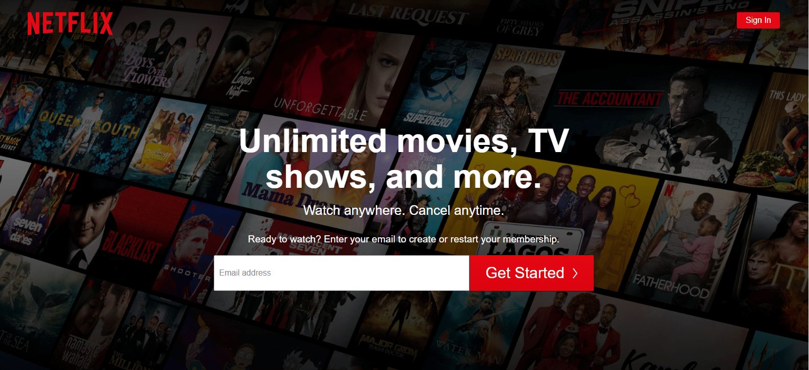
Source / Netflix.com
Notice the imperative tone: “Get started,” “Watch anywhere.”
Here’s another call to action example:

Source / Avg.com
AVG kept it simple. The company made its CTA pop out and kept everything above the page fold. Take a second look; it’s telling you that you can download the AVG antivirus software for “FREE” by just clicking on the green button, even though you’ll still need to part with some cash if you wish to secure additional protection for your PC. They kept their call-to-action focused on the free version of their software, which though is an option, lowers the risk factor that keeps most users away from considering paid subscriptions.
CTAs in Graphics
Depending on your business values or ideology, you may choose to use graphic designs with more colorful illustrations to execute your marketing call to action. Source / Blog.Wishpond.com
Here’s Zendesk, a leading customer service software provider using a clean graphic design on their website’s home page.
Social Media/ Text CTAs
As a copywriter or social media manager, your marketing skills come in handy if you can mesmerize a potential customer with a killer ad copy and the best call to action words.

Source / Blog.Hubspot.com
This post advertising Nemo Hornet 2P Tent has a more subtle CTA with a sense of humor. It’s a great example of how calls to action can be used more subtly on social media, boosted by the text surrounding it.
The Best Call to Action Words and Phrases
In the digital advertising space, a lot of time, effort, and money are spent on web and graphic designs, page layout, user interface, and more. Because of this, sometimes little attention is given to the CTA button. It’s more than a button or link; it’s an expression and reflection of what your ad copy is all about. Inject some dynamism and creativity and choose a phrase tailored to your ad campaign.
Looking for a list containing the best call-to-action words might be a long shot, but here are some call to action words and phrases that have proven effective. These could also pass for call to action button examples:
- Get Started
- Sign Up Free
- Create Account
- Learn More
- Explore
- Discover
- Get __% Off
- Try for Free
- Shop Now
Conclusion
To wrap things up, paying more attention to your call to action will do your marketing project a whole world of good. For most successful CTAs, the devil is in the detail. Speak according to your brand identity, be creative, be clear and concise, use action verbs, sprinkle a little bit of witty humor if need be, and viola! You’ll be good to go.
