Lufthansa, Burger King and more: top creative ads of the week
Every week I attempt to share curated list of clutter-breaking creative ads, including the occasional design & packaging work. This week’s compilation included new work for Lufthansa, Burger King and more.
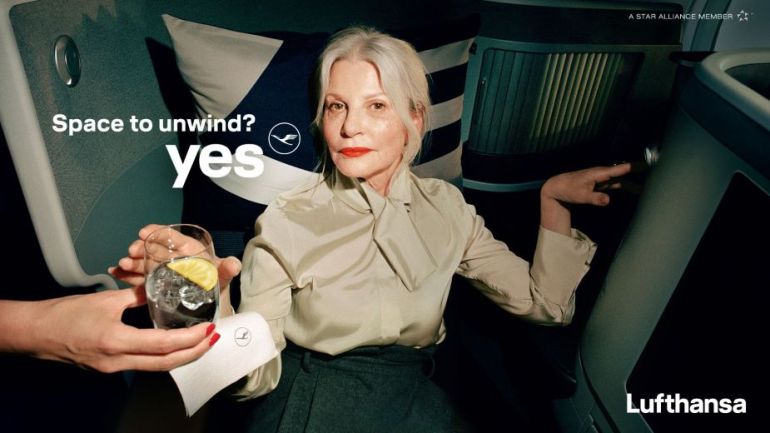
Lufthansa: a new travel experience
I had taken potshots at Lufthansa’s ‘Yes’ campaign idea on LinkedIn a few months ago. Devoid of any context, just a ‘yes’ and the logo seemed puzzling. The ‘Yes’ platform has been given a context in a new ad which introduces their Allegris cabins which offer personalised seating options.
The various types of seats not only make optimal use of space, but offer guests very different benefits. For example, some seats can be transformed into extra-long beds, while others feature cots or extra room for a more relaxed working space.
The ad creates a mood, an atmosphere and ties back to the brand platform with questions such as ‘Time to relax?’ ‘Time to get work done?’ etc. which drive home the message of personalisation.
Agency: Serviceplan
The static images work much better than the original thematic campaign creatives. But as you in the outdoor kiosk images there’s a tradeoff between highlighting the benefit of the Allegris offering and the brand theme.


Pluto TV: couch potato
Sometimes, a literal depiction of a metaphor grabs attention and is memorable. ‘Couch potatoes’ come alive in this ad, starring actor Gary Sinise, for Pluto TV which is a FAST platform (free ad-supported streaming television). Loved the tagline, ‘Stream Now, Pay Never’.
Agency: Haymaker
Super Money: no more meh offers
‘What user pain points does this solve?’ is a common question when evaluating a new digital product or service. UPI-based payment apps are common in India now and there’s not much to distinguish between them in terms of performance. Speed of transaction, security and ease of use are all boxes ticked by most players. Brands attempt to foster loyalty by offering rewards for regular usage. But the ‘pain-point’ in most cases is the utter silliness of the rewards and how generic and un-customised they are. Back from my direct response advertising days the fundamentals emphasise on being relevant and making personalised offers.
Brands where direct marketing played a role in customer acquisition & retention – such as Reader’s Digest or National Geographic relied on relevant offers that were tailored to suit the buyer’s needs. Super Money, a new payment platform, tries to re-position other rewards as boring. The app promises cash back and lucrative prizes every hour on usage. The creative idea is a literal portrayal of ‘meh’ which is a common reference to pedestrian or boring stuff. The expression may appeal to English speaking urban audience who may very well be the early adopters.
Burger King: bundles of joy
Tongue-in-cheek advertising seems to be a specialty of advertising from the UK. In 2021, KFC asked other brands if they could ‘borrow’ their slogan as ‘Finger lickin’ good’ was inappropriate during those times.
Apparently, September 26 is the day most babies are born in UK. In a cheeky campaign, Burger King juxtaposes the ‘arrival’ of a baby to the delivery time of the burger. It all falls into place when you connect with the craving we all have for a satisfying meal or snack after a moment that drains you out. A survey revealed that ‘for many mothers, the food you have straight after birth is one of the most amazing and unforgettable feelings ever; a burger and fries were amongst the most wanted post-birth indulgences‘. Brought a smile to my face when the ‘big moment’ in the TVC was the arrival of the delivery person:)
Agency: BBH


Mozilla: brand identity
I am a big fan of brand identity re-designs: it is not all about pretty pictures – there is admirable ‘strategy’ and design chops on display. Also, some of the best work is about great storytelling – giving a glimpse of the thinking behind the project. In one such project for Mozilla the M is made to look like a flag:
Mozilla’s flag symbol highlights the brand’s activist spirit, signifying a commitment to ‘Reclaim the Internet.’.


Agency: JKR
Early Partners: website
Most of us would have a conventional approach for a website to launch a new agency brand: services, work, industries, team and contact as key sections. We forget it’s not about us. It’s about the intended user – addressing their pain points, conveying a benefit in a persuasive manner. A consultancy to solve early stage marketing problems of early stage businesses has taken a minimalistic, Q&A approach to introduce themselves and what they do. In a sea of sameness, it truly stands out – and very importantly, being relevant.

The London Standard: relaunch cover design
I love magazine and newspaper design. Crafting a distinct look in a cluttered market is no easy task and very few media brands have managed to do that – NYT, FT, The Guardian, WSJ and The Economist come to mind. It goes beyond just design but has to dovetail into content strategy and brand personality. Sadly, news brands from India care two hoots about user experience, especially on digital. A new design project for The London Standard – now re-positioned as a weekly caught my thanks to a stunning cover design which sits so well with the lead story.

Agency: Mark Porter Associates
Channel 4: Great British Bakeoff
‘Less current affairs. More Chocolate Eclairs’. Loved the announcement ad for the new season of The Great British Bake Off’. Who said tactical announcements have to be boring?

Which one was your favourite? Do comment in.
