Color Psychology in Marketing
Color has a major influence on people, and when it comes to marketing, the colors you use will impact the choices consumers make. In this article, we’re going to talk about the psychology of color in marketing, how it’s used by leading digital advertising agencies and experts, and what tactics you should consider for your own branding and graphics. Let’s get into it!
Is Color Psychology Real?
Yes! Colors appeal to the emotion sensors in the brain, and all sorts of outcomes are possible. A certain color, like red or yellow, can pull your attention to something specific, while other colors may be reassuring, cause a particular emotion to rise up, or remind you of something from your past.
Color psychology most often relates to how people experienced different colors during childhood, and those feelings carry over into adulthood. For example, red is associated with firetrucks and yellow may be associated with the sun or a school bus. These associations are what color psychology is built on.
It’s important to note that different cultures have different associations, so what a color means to one person may mean something else – worse or better – to someone from a different part of the world. This is especially important to keep in mind if you advertise to an international market.
How is Color Psychology Used in Marketing?
When it comes to color psychology in marketing, the hues you use can make or break the message you’re trying to send. And it’s about more than individual colors, too. The color combinations you choose and even how much of each color is included can influence consumers.
Let’s start with a brief color emotion guide to better understand the psychology of colors in marketing:
- Black: Elegance, finesse, luxury
- Blue: Airiness and freshness or knowledge and leadership (depending on the shade)
- Green: Balance, environment, harmony, nature, refreshment
- Orange: Happiness, movement, playfulness, vibrancy
- Pink: Happiness, positivity
- Purple: Honesty, power, religion, royalty, well-being
- Red: Endurance, importance, power, protection
- Yellow: Creativity, liveliness, optimism, playfulness, vibrancy
White is also an important part of marketing color schemes, mainly for the negative space it creates. It’s often used as an accent or background to the rest of the design. Graphics without any white can be too bold and overwhelming; complementing a design with white (or a shade of white) can make the imagery easier for the brain to process.
That said, the absence of white can be purposeful so that the graphic is forceful:
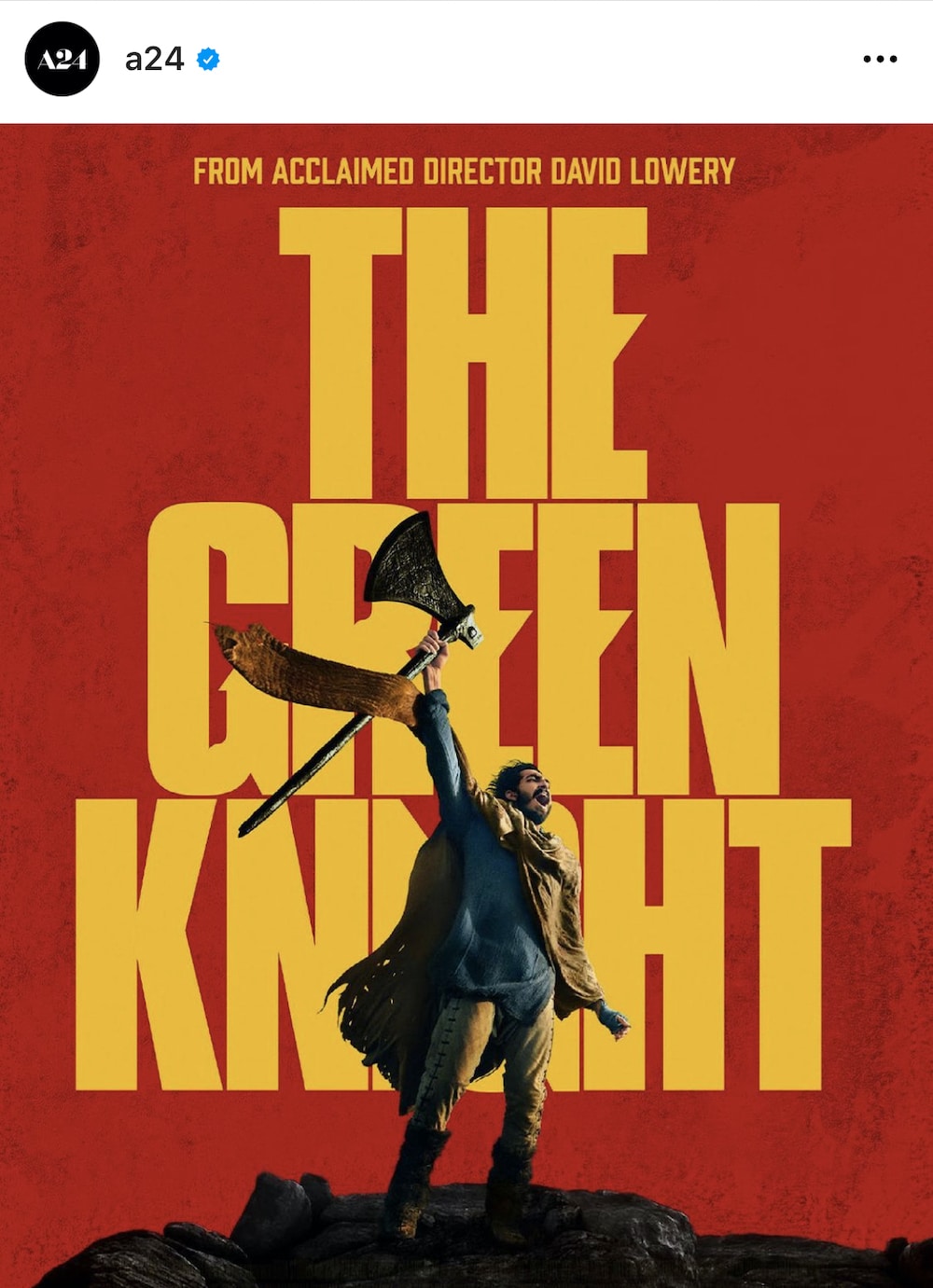
A24 / Instagram
Lifehacker has a great color psychology chart here.
Color Nuances
Even though certain colors often relate to a particular set of reactions, you have to take nuances into consideration.
For example, while yellow may often represent happiness, it can take on a completely different connotation depending on how it’s used. Coupled with a scary image and huge, bold text, it may become aggressive rather than happy. In this example, the yellow is bold and powerful rather than cheerful.

Ad World Conference / Facebook
Another example involves the color red. Depending on the imagery and text you couple red with, it can be positive and exciting or negative and a warning.
Color Combinations
Each color falls into one of two categories:
Cool: Blue, green, violet.
Warm: Orange, red, yellow.
Cool colors represent clear skies, ice, nature, and water. They make everything feel big, clean, and fresh. Warm colors represent fire, heat, and sunsets. They make everything feel comfy, cozy, and inviting. To create harmony, cool and warm colors are often used in the same graphic.
Complementary cool and warm colors come from opposite sides of the color wheel. For example, red is a good complement to green, blue is a complement to orange, and yellow is a complement to violet. When using complementary colors, try to make one take up 80% of the design and the other only 20%. This balance makes the imagery easier to look at than if it were split 50-50.
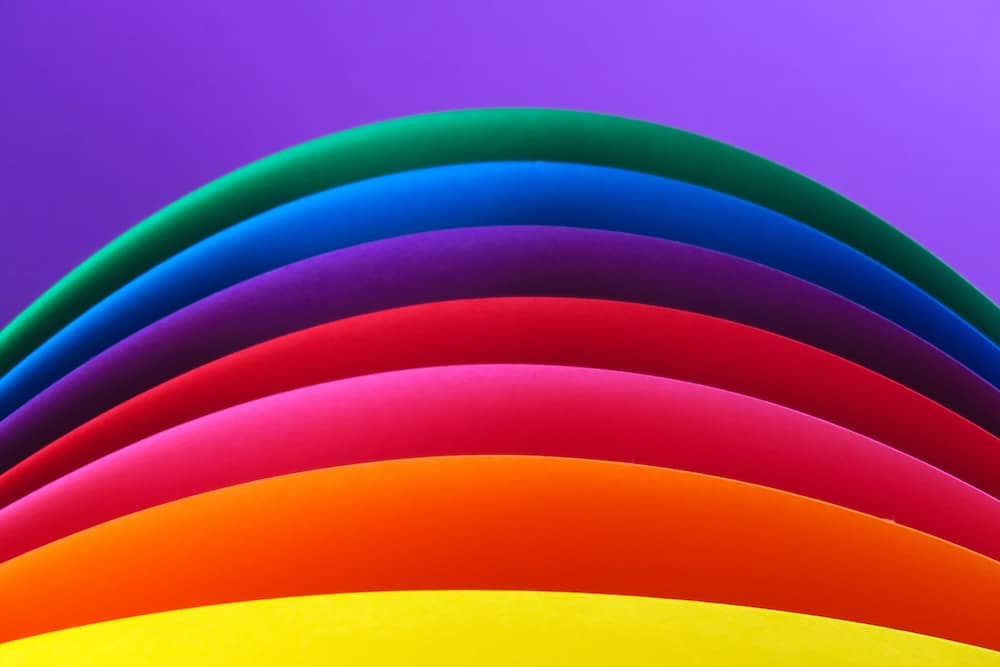
Multicolored Graphics in Marketing
What happens if you combine (almost) all of the colors? You get a youthful graphic that conveys fun, and you tell consumers that your brand is spirited.
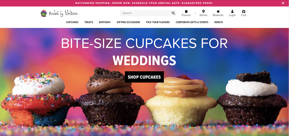
Source / Baked by Melissa
However, the purpose of a multicolored graphic could be to catch your attention. Visme isn’t nearly as fun a company as a cupcake maker, but they use various bright colors in this infographic to make it eye-catching.
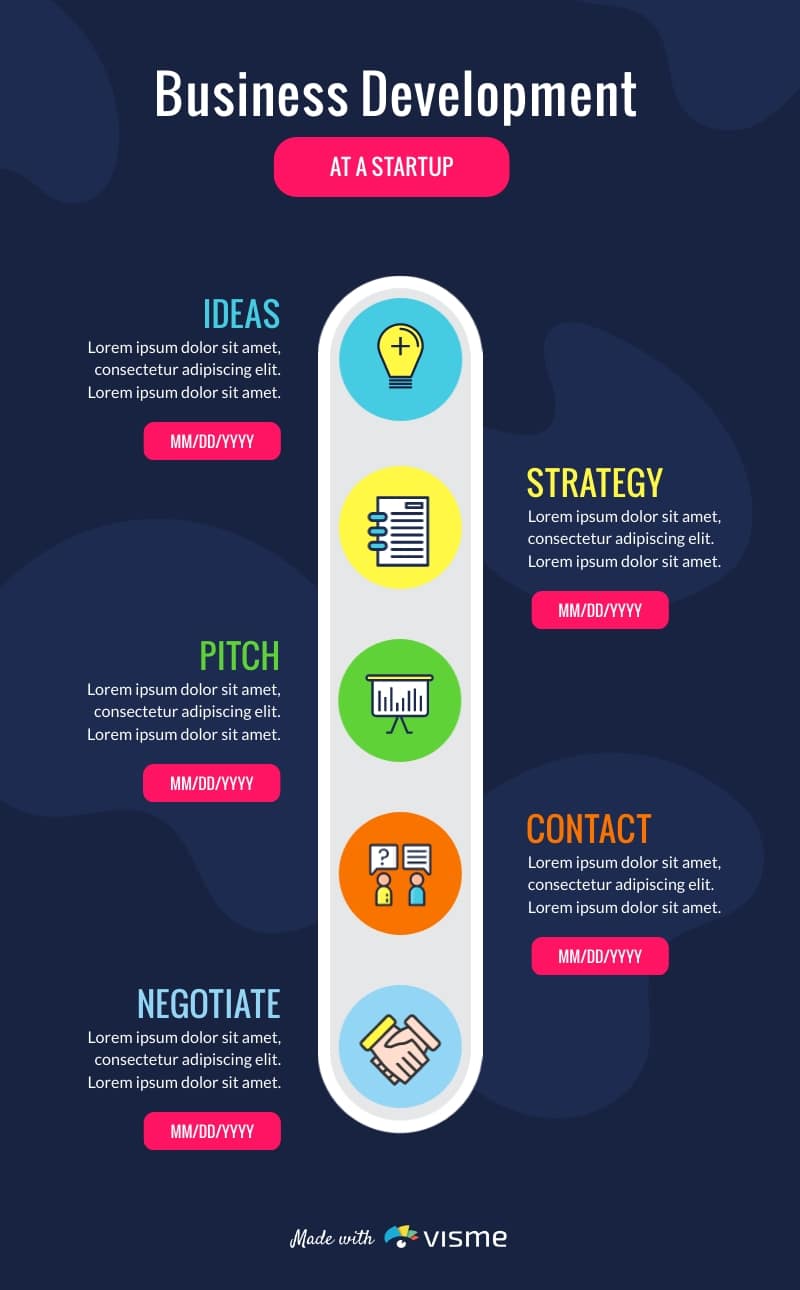
Source / Visme
Why is Blue Such a Popular Color for Designs and Logos?
Blue is a common branding and marketing color because it can have all sorts of associations. Sky blue can give a refreshing, open-air feel, while navy blue is associated with knowledge and leadership. Pastel blue is often used for children’s brands.
Corporate and tech brands use blue because it’s a pleasing color that’s not polarizing and that communicates intelligence, reliability, and trust. And health organizations often use soft blue hues because they’re mild and clean.
What Are the Best Colors for Call-to-Action Buttons?
Many call-to-action (CTA) buttons are red because the color stands out, is easy to spot, and conveys a sense of importance. In the example below, the “Get the ebook” CTA button is in red.

Source / Envoy / Facebook
In general, if cool and warm colors are used in the same graphic, one or the other should be used on the CTA button. In the example above, the illustrations are in cool blue, while the CTA is in warm red.
Wrapping Up
Colors and emotions are inextricably linked. Choosing the right colors for your brand and marketing collateral is just as important as the wording you use – possibly even more important since the colors will be viewed and processed by the brain before the text. Understanding color psychology marketing can help you choose the color schemes that will positively represent your brand and make the biggest impression on consumers.
Want to dive further into the world of marketing theory? We have six more for you to explore in this blog post!